 Türkçe
 العربية
 Deutsch
 English
 Español
 Français
 Italiano
 Português
 Русский
 Tiếng Việt


Responsive Image Cropping and Resizing: The Frontend Developer's Asset Pipeline Guide
Mastering aspect ratios, art direction, srcset resolution switching, and Core Web Vitals.
 By LinkeFly Editorial Team
Images account for more than 60% of total web page payload weight on modern websites. Yet, despite widespread broadband adoption, unoptimized imagery remains the single largest cause of poor mobile web performance, layout instability, and failing Largest Contentful Paint (LCP) scores in Google's Core Web Vitals.
Modern responsive web design requires a sophisticated multi-format asset pipeline: cropping photos to precise aspect ratios across desktop and mobile viewports, serving multiple resolutions for high-DPI retina displays, and implementing automated art direction. In this guide, we break down aspect ratio standards, dissect HTML5 <picture> and srcset markup, and explain automated cropping workflows.
1. Standard Web and Social Aspect Ratios
An aspect ratio represents the proportional relationship between an image's width and height, independent of absolute pixel dimensions:
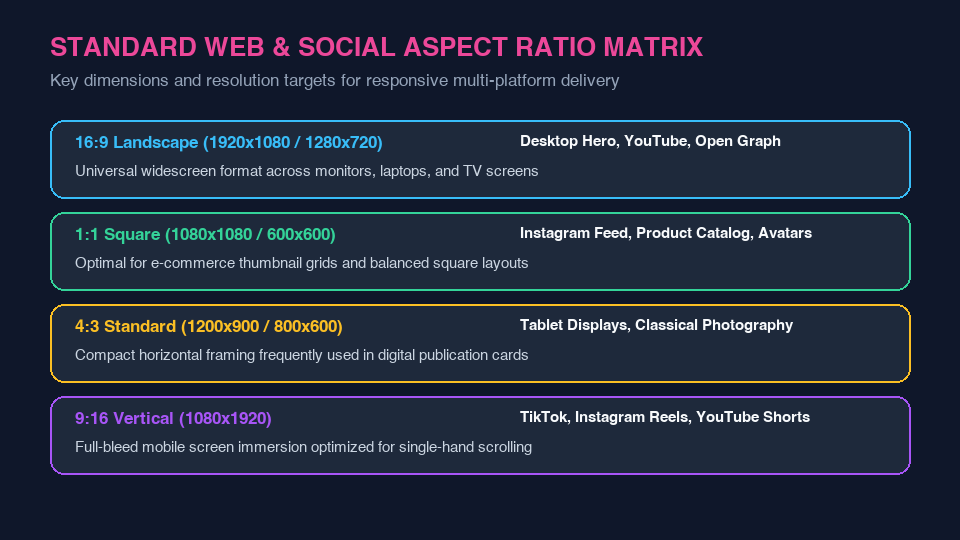
- 16:9 (Landscape - 1920x1080 / 1280x720): The universal widescreen standard across desktop hero banners, YouTube video covers, and Open Graph social share cards.
- 1:1 (Square - 1080x1080 / 600x600): The e-commerce industry standard for product catalog grids, Instagram posts, and user profile avatars.
- 4:3 (Traditional - 1200x900 / 800x600): Common in tablet UI viewports, digital editorial publication cards, and vintage photography.
- 9:16 (Vertical Full-Bleed - 1080x1920): Mobile immersive format optimized for vertical smartphone viewports (TikTok, Instagram Reels, YouTube Shorts).
2. HTML5 Art Direction vs Resolution Switching
Delivering high-resolution assets efficiently requires understanding the fundamental distinction between resolution switching and art direction:
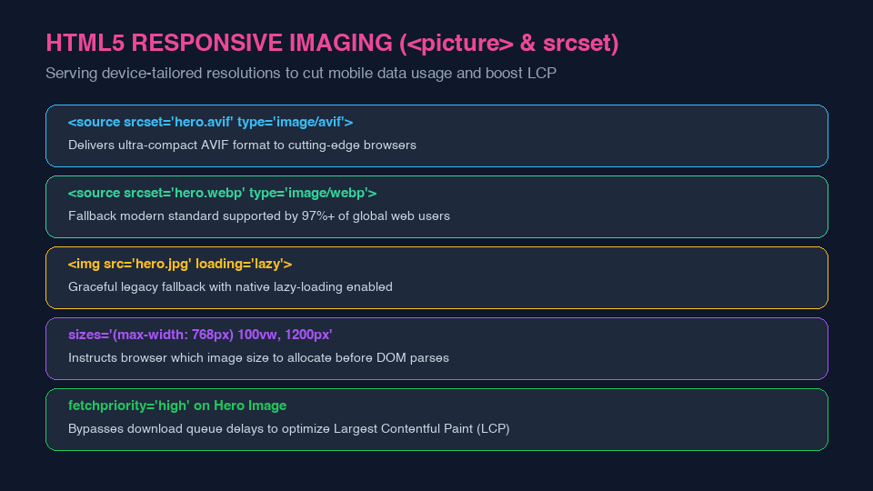
A. Resolution Switching (srcset and sizes)
When the visual crop of the image remains identical across devices, but you want to serve smaller file sizes to smartphones and high-DPI assets to 4K monitors, use standard srcset:
<img src="hero-800.jpg"
     srcset="hero-400.jpg 400w, hero-800.jpg 800w, hero-1600.jpg 1600w"
     sizes="(max-width: 768px) 100vw, 1200px"
     alt="Responsive Hero Banner"
     loading="lazy">
B. Art Direction (<picture> Element)
When an image must physically change its composition—such as showing a wide landscape crop on desktop but a tight, zoomed square crop focused on a person's face on mobile—wrap distinct sources inside a <picture> container with media queries.
3. Preventing Cumulative Layout Shift (CLS)
Whenever you add images to web layouts, always declare explicit width and height HTML attributes (or CSS aspect-ratio properties). This allows modern browser layout engines to calculate the exact spatial container footprint before the image bytes download, preventing sudden, jarring page jumps that hurt Google Core Web Vitals.
Crop and Resize Images Client-Side
Need to crop hero banners to exact aspect ratios or resize product photography for web uploads? Utilize the free LinkeFly Image Resizer and Image Cropper Tool to prepare optimized assets directly inside your browser with complete privacy.
Frequently Asked Questions (FAQ)
loading="lazy" to above-the-fold hero images or Largest Contentful Paint candidates. Lazy loading delays hero image discovery by the browser's preload scanner, worsening LCP times. Instead, add fetchpriority="high" to your primary hero image.aspect-ratio: 16 / 9; automatically preserves a box's proportions regardless of dynamic width scaling, replacing legacy padding-bottom container hacks across all modern browsers.