 Italiano
 العربية
 Deutsch
 English
 Español
 Français
 Português
 Русский
 Türkçe
 Tiếng Việt


YouTube Thumbnail Optimization: The Psychology of High-CTR Cover Images
Resolution standards, safe zones, color psychology, and mobile feed glance tests.
 By LinkeFly Editorial Team
On YouTube, where over 500 hours of video are uploaded every single minute, your thumbnail is your billboard. Even the most meticulously edited, high-budget video will languish with zero views if its visual packaging fails to capture user attention in the recommendations feed. In YouTube's algorithmic ecosystem, Click-Through Rate (CTR) is the primary gateway signal that unlocks algorithmic distribution.
Thumbnails operate in an unforgiving environment: competing against dozens of rival videos on tiny mobile phone displays where users scroll past in fractions of a second. In this masterclass guide, we examine the technical specifications, visual psychology, safe-zone layout rules, and competitive benchmarking frameworks that turn passive scrollers into engaged viewers.
1. The Technical Blueprint: Dimensions and Compression Standards
To avoid ugly scaling artifacts or rejection by YouTube's processing pipeline, creators must adhere to Google's official technical parameters:
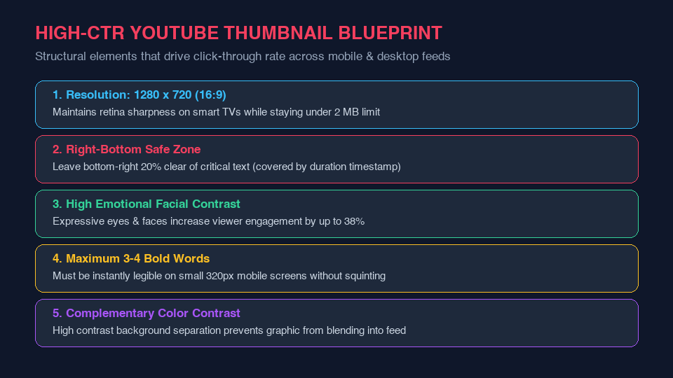
- Ideal Resolution: 1280 x 720 pixels (minimum width 640 pixels). While displayed smaller on mobile screens, 1280x720 ensures razor-sharp rendering on 4K Smart TVs and Retina desktop displays.
- Aspect Ratio: Strictly 16:9 widescreen. Uploading 4:3 or square images results in black pillarbox padding that diminishes visual impact.
- File Size Ceiling: Under 2 MB for standard uploads.
- Permitted Formats: JPG, GIF, or PNG. High-quality 24-bit PNG or 90% quality JPG is optimal.
2. The Critical Timestamp Safe Zone
The single most widespread amateur mistake in thumbnail design is placing critical text or faces in the bottom-right corner. When YouTube renders video cards across mobile apps and desktop homepages, it overlays the semi-transparent black video duration badge (e.g. 12:45) over the bottom-right 20% of the canvas. Any text, punchline, or branding placed in this danger zone is completely obliterated.
3. Visual Psychology and The 3-Second Glance Test
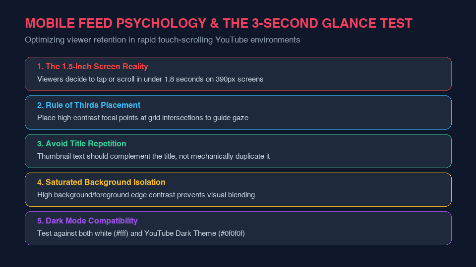
Modern mobile feed consumption is dictated by rapid, semi-conscious thumb gestures. A thumbnail has less than 1.8 seconds to communicate a clear visual value proposition before the user scrolls past.
A. Emotional Facial Expression
Humans are biologically hardwired to notice human faces and decipher micro-expressions. Large, expressive facial features (surprise, intensity, joy, skepticism) with eyes directed towards the primary subject increase viewer emotional resonance by up to 38%.
B. The 3-Word Rule
Never transcribe the video title onto the thumbnail. The thumbnail and the title should work as complementary puzzle pieces: the thumbnail sparks curiosity, while the title confirms the topic. Limit thumbnail text to 2–4 bold, high-contrast words rendered in heavy sans-serif typography (e.g. Montserrat, Bebas Neue, Impact) with dark drop shadows or stroke outlines.
Inspect Competitor Thumbnails at Maximum Resolution
Want to analyze successful creators' thumbnail compositions, color grading, and compression quality at full 1080p and 720p resolution? Use the free LinkeFly YouTube Thumbnail Downloader to fetch original high-resolution thumbnail assets instantly by simply pasting any video URL.